 techiny.com
 Responsive design uses flexible grids and fluid images to ensure digital media pets display seamlessly across all devices, adjusting dynamically to screen size. Adaptive design employs fixed layouts tailored to specific device types, providing optimized experiences on predetermined screen dimensions. Choosing between responsive and adaptive design depends on whether uniform flexibility or targeted customization is prioritized for digital media pet content delivery.
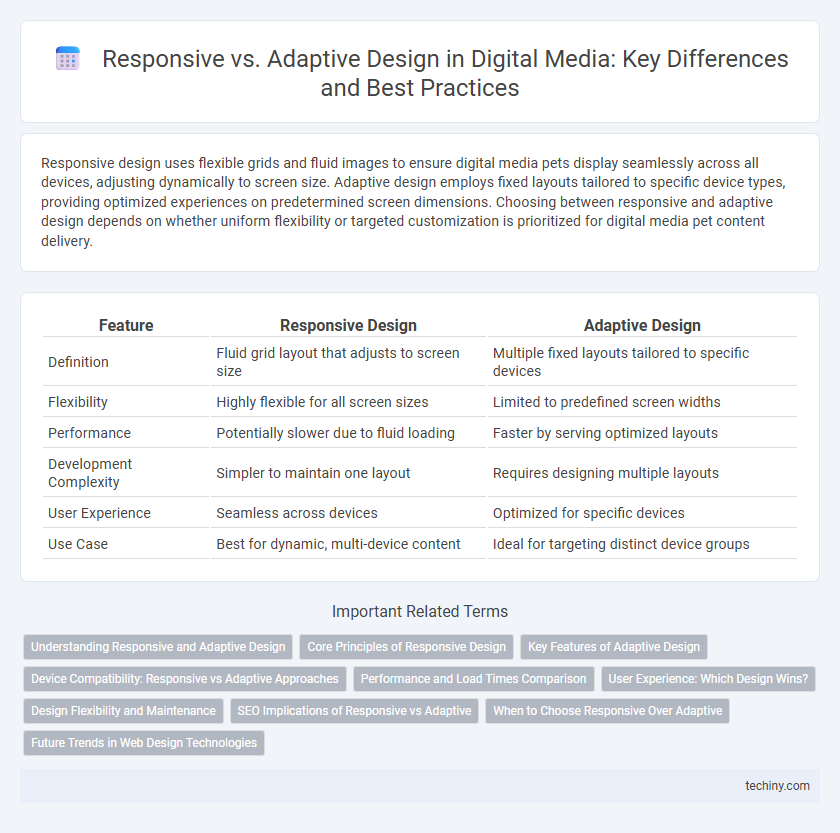
Table of Comparison
| Feature | Responsive Design | Adaptive Design |
|---|---|---|
| Definition | Fluid grid layout that adjusts to screen size | Multiple fixed layouts tailored to specific devices |
| Flexibility | Highly flexible for all screen sizes | Limited to predefined screen widths |
| Performance | Potentially slower due to fluid loading | Faster by serving optimized layouts |
| Development Complexity | Simpler to maintain one layout | Requires designing multiple layouts |
| User Experience | Seamless across devices | Optimized for specific devices |
| Use Case | Best for dynamic, multi-device content | Ideal for targeting distinct device groups |
Understanding Responsive and Adaptive Design
Responsive design uses flexible grid layouts and media queries to adjust content seamlessly across diverse screen sizes, ensuring a consistent user experience. Adaptive design delivers multiple fixed layouts tailored to specific device breakpoints, enhancing performance by optimizing content for each distinct screen. Both approaches aim to improve usability and accessibility, but responsive design emphasizes fluidity, while adaptive design focuses on device-specific customization.
Core Principles of Responsive Design
Responsive design relies on flexible grid layouts, fluid images, and CSS media queries to create websites that seamlessly adjust to various screen sizes and orientations. It emphasizes a single, dynamic design framework that adapts content and interface elements based on the user's device characteristics. This approach enhances user experience by ensuring consistent accessibility and usability across desktops, tablets, and smartphones without requiring multiple versions of a site.
Key Features of Adaptive Design
Adaptive design uses multiple fixed layout sizes tailored to specific device resolutions, ensuring optimal display on smartphones, tablets, and desktops. It detects the user's device and loads the appropriate layout, enhancing performance and user experience by minimizing unnecessary code and assets. Key features include device-specific templates, predefined screen widths, and enhanced control over design elements for each target device.
Device Compatibility: Responsive vs Adaptive Approaches
Responsive design uses flexible grids and media queries to ensure content automatically adjusts to any device screen size, providing seamless compatibility across all devices. Adaptive design detects specific devices and delivers tailored layouts optimized for predefined screen sizes, enhancing performance on targeted devices. Device compatibility in responsive design offers universal flexibility, while adaptive design prioritizes precision and customization for distinct device categories.
Performance and Load Times Comparison
Responsive design uses flexible grids and media queries to adapt content fluidly across devices, often resulting in faster load times due to a single codebase and optimized resource delivery. Adaptive design relies on predefined layouts tailored to specific screen sizes, which can increase load times as multiple versions of assets must be managed and served. Performance metrics generally favor responsive design for quicker initial rendering and reduced bandwidth consumption, crucial factors for mobile user experience.
User Experience: Which Design Wins?
Responsive design offers seamless user experience by fluidly adjusting layouts across all screen sizes, ensuring consistent accessibility and readability. Adaptive design delivers tailored experiences by detecting specific device types and loading predefined layouts optimized for performance and usability. For dynamic user environments, responsive design generally wins due to its flexibility and uniform interaction across diverse devices.
Design Flexibility and Maintenance
Responsive design offers greater flexibility by using fluid grids and media queries to adapt seamlessly across devices, reducing the need for multiple layouts. Adaptive design relies on predefined fixed layouts tailored to specific screen sizes, which can increase maintenance complexity as updates must be applied to each layout individually. Responsive design typically simplifies ongoing maintenance due to its unified codebase, while adaptive design may require more frequent adjustments to accommodate new devices or changes in user behavior.
SEO Implications of Responsive vs Adaptive
Responsive design enhances SEO by providing a single URL and consistent HTML, enabling easier crawling and indexing by search engines. Adaptive design, with multiple URLs for different devices, may complicate SEO due to duplicate content risks and requires careful implementation of canonical tags. Google favors responsive design for mobile-first indexing, improving site speed and user experience, which are key ranking factors.
When to Choose Responsive Over Adaptive
Responsive design excels in projects requiring seamless user experiences across a wide range of devices with fluid grids and flexible images. It's ideal when content consistency and continuous scalability on various screen sizes are critical, such as in e-commerce platforms or dynamic blogs. Opt for responsive design when development speed and ease of maintenance are priorities due to its one-codebase approach.
Future Trends in Web Design Technologies
Responsive design utilizes flexible grids and media queries to ensure seamless user experiences across various devices, while adaptive design employs multiple fixed layouts tailored to specific screen sizes. Emerging trends in web design emphasize AI-driven customization and progressive web apps, pushing both responsive and adaptive frameworks toward more intelligent, context-aware interfaces. Integration of 5G and enhanced browser capabilities will accelerate real-time adaptability, making future web design highly personalized and performance-optimized.
Responsive vs Adaptive Design Infographic