 techiny.com
 Responsive web design uses flexible grids and layouts that automatically adjust to any screen size, offering seamless user experience across devices. Adaptive web design relies on predefined layouts tailored to specific device categories, providing optimized performance but less flexibility. Choosing between them depends on project goals, with responsive design suited for broad compatibility and adaptive design ideal for targeted device experiences.
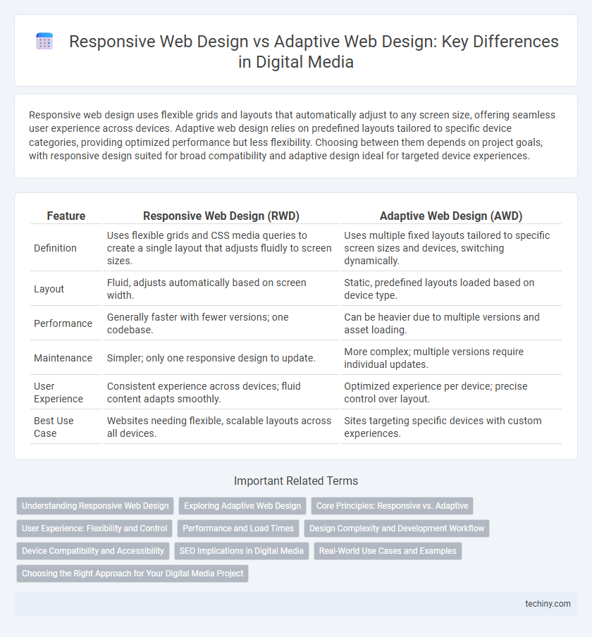
Table of Comparison
| Feature | Responsive Web Design (RWD) | Adaptive Web Design (AWD) |
|---|---|---|
| Definition | Uses flexible grids and CSS media queries to create a single layout that adjusts fluidly to screen sizes. | Uses multiple fixed layouts tailored to specific screen sizes and devices, switching dynamically. |
| Layout | Fluid, adjusts automatically based on screen width. | Static, predefined layouts loaded based on device type. |
| Performance | Generally faster with fewer versions; one codebase. | Can be heavier due to multiple versions and asset loading. |
| Maintenance | Simpler; only one responsive design to update. | More complex; multiple versions require individual updates. |
| User Experience | Consistent experience across devices; fluid content adapts smoothly. | Optimized experience per device; precise control over layout. |
| Best Use Case | Websites needing flexible, scalable layouts across all devices. | Sites targeting specific devices with custom experiences. |
Understanding Responsive Web Design
Responsive web design uses fluid grids, flexible images, and CSS media queries to create a seamless user experience across different devices by automatically adjusting the layout based on screen size. This approach ensures consistent usability and visual appeal without the need for multiple distinct versions of a website. Emphasizing mobile-first principles, responsive design enhances accessibility and performance, adapting content fluidly to various screen resolutions and orientations.
Exploring Adaptive Web Design
Adaptive web design uses multiple fixed layouts tailored to specific device types, enhancing user experience by delivering customized interfaces based on screen size and capabilities. This approach relies on server-side detection to identify the device and serve the appropriate layout, optimizing load times and performance. By focusing on tailored content delivery, adaptive design ensures better usability across diverse devices compared to the fluid grids of responsive web design.
Core Principles: Responsive vs. Adaptive
Responsive web design employs fluid grids and flexible images to create layouts that automatically adjust to any screen size, ensuring consistent user experience across devices. Adaptive web design uses multiple fixed layout sizes, detecting the device type and loading the most appropriate version, optimizing performance for specific screens. Core principles highlight responsiveness' focus on fluidity and flexibility, while adaptability prioritizes device-specific optimization and tailored user interfaces.
User Experience: Flexibility and Control
Responsive web design offers seamless flexibility by automatically adjusting layouts to fit any screen size, enhancing user experience across devices. Adaptive web design provides greater control through predefined layouts tailored to specific devices, optimizing performance and usability. Balancing flexibility and control ensures users receive consistent, intuitive interactions regardless of their device.
Performance and Load Times
Responsive web design uses fluid grids and CSS media queries to adjust layouts dynamically, ensuring consistent performance across devices by minimizing resource duplication. Adaptive web design loads distinct page templates optimized for specific device types, which can improve performance by serving tailored content but may increase load times due to multiple server requests. Optimizing asset delivery and minimizing HTTP requests are crucial factors influencing load performance in both responsive and adaptive approaches.
Design Complexity and Development Workflow
Responsive web design utilizes flexible grids and media queries to create a seamless user experience across devices, reducing design complexity by maintaining a single fluid layout. Adaptive web design requires multiple fixed layouts tailored to specific screen sizes, increasing design complexity due to the need for distinct templates and additional testing. Development workflow in responsive design is more streamlined with uniform codebases, while adaptive design demands separate development paths for each layout, impacting project timelines and maintenance efforts.
Device Compatibility and Accessibility
Responsive web design uses fluid grids and flexible images to ensure seamless device compatibility, automatically adjusting the layout based on screen size for consistent accessibility across smartphones, tablets, and desktops. Adaptive web design employs multiple fixed layouts tailored to specific device categories, enhancing performance and tailored user experience but may limit accessibility on less common screen sizes. Both approaches prioritize accessibility, but responsive design offers broader compatibility by dynamically adapting to any device resolution without predefined breakpoints.
SEO Implications in Digital Media
Responsive web design improves SEO by providing a unified URL structure and consistent HTML content, enhancing crawl efficiency and reducing duplicate content issues. Adaptive web design, while offering tailored user experiences through multiple fixed layouts, risks SEO challenges due to separate URLs and variable content, potentially complicating indexing and user engagement metrics. Search engines favor responsive designs for mobile-first indexing, making it the preferred approach in digital media for optimal search visibility and user experience.
Real-World Use Cases and Examples
Responsive web design employs fluid grids and flexible images to ensure seamless user experiences across all devices, making it ideal for content-heavy sites like news portals and blogs where consistent accessibility is crucial. Adaptive web design uses multiple fixed layouts tailored to specific screen sizes, enhancing performance and usability for e-commerce platforms such as Amazon and eBay, where optimized loading times and targeted content delivery are essential. Major brands like Starbucks utilize responsive design for global reach, while platforms like Airbnb leverage adaptive design to cater to diverse device capabilities and improve booking processes.
Choosing the Right Approach for Your Digital Media Project
Responsive web design offers fluid grids and flexible images that automatically adjust to various screen sizes, ensuring a seamless user experience across devices. Adaptive web design uses fixed layouts tailored to specific screen widths, providing optimized performance and control for targeted devices. Selecting the right approach depends on factors such as project budget, target audience device diversity, and the desired balance between design consistency and customization.
responsive web design vs adaptive web design Infographic