 techiny.com
 CSS Grid excels at creating complex, two-dimensional layouts by defining rows and columns, making it ideal for overall page structure. Flexbox offers more flexibility for one-dimensional layouts, aligning and distributing items within a single row or column with ease. Understanding when to use CSS Grid versus Flexbox enhances responsive design and optimizes web page performance.
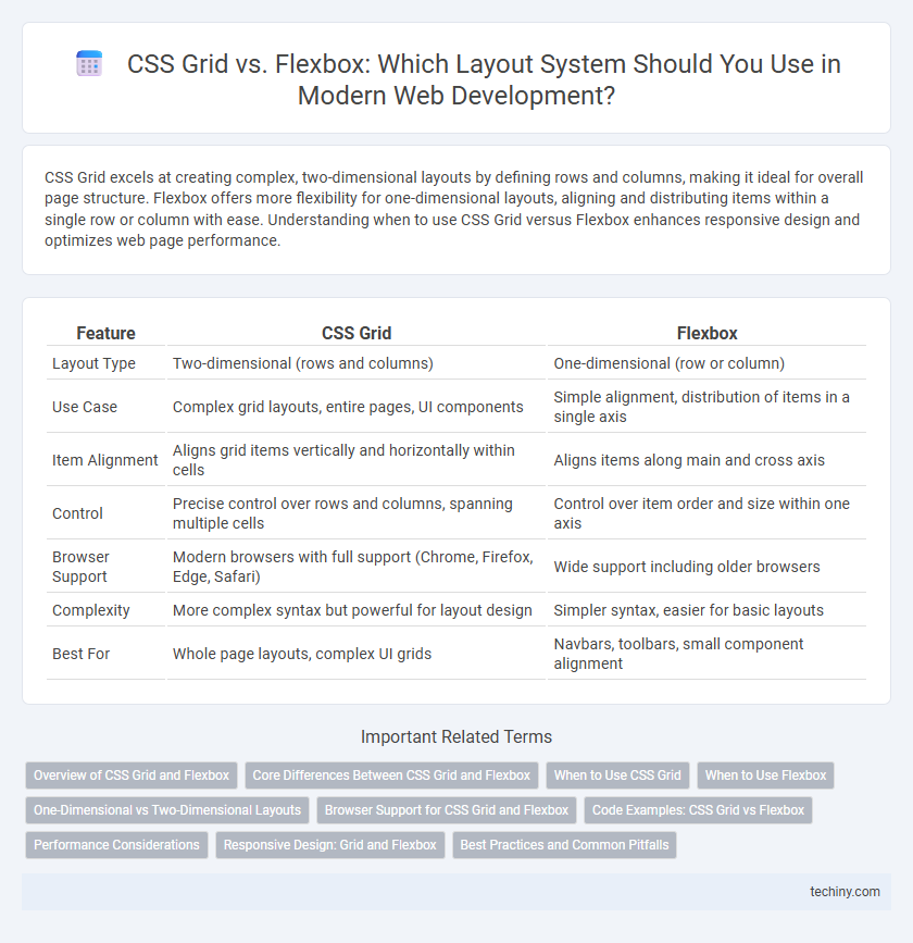
Table of Comparison
| Feature | CSS Grid | Flexbox |
|---|---|---|
| Layout Type | Two-dimensional (rows and columns) | One-dimensional (row or column) |
| Use Case | Complex grid layouts, entire pages, UI components | Simple alignment, distribution of items in a single axis |
| Item Alignment | Aligns grid items vertically and horizontally within cells | Aligns items along main and cross axis |
| Control | Precise control over rows and columns, spanning multiple cells | Control over item order and size within one axis |
| Browser Support | Modern browsers with full support (Chrome, Firefox, Edge, Safari) | Wide support including older browsers |
| Complexity | More complex syntax but powerful for layout design | Simpler syntax, easier for basic layouts |
| Best For | Whole page layouts, complex UI grids | Navbars, toolbars, small component alignment |
Overview of CSS Grid and Flexbox
CSS Grid is a two-dimensional layout system designed for creating complex web layouts with precise control over rows and columns, making it ideal for large-scale designs. Flexbox is a one-dimensional layout model that excels at distributing space along a single axis, either row or column, perfect for aligning items within a container. Both CSS Grid and Flexbox offer responsive design capabilities but serve different purposes depending on layout complexity and direction control.
Core Differences Between CSS Grid and Flexbox
CSS Grid is designed for two-dimensional layout, allowing control over both rows and columns simultaneously, while Flexbox excels at one-dimensional layouts, either in a row or column. CSS Grid provides explicit placement of items within a grid structure with precise control over sizing, gaps, and alignment, whereas Flexbox focuses on content flow and distribution within a flexible container. The core distinction lies in CSS Grid's ability to create complex, grid-based designs versus Flexbox's strength in arranging items in a linear, adaptive manner.
When to Use CSS Grid
CSS Grid excels in creating complex, two-dimensional layouts where both rows and columns need precise control, making it ideal for web pages with multiple content sections or asymmetrical designs. It provides a robust framework for defining explicit grid lines, enabling developers to align items both horizontally and vertically with ease. Use CSS Grid when building responsive layouts that require consistent spacing and alignment across various screen sizes.
When to Use Flexbox
Flexbox excels in one-dimensional layouts, making it ideal for arranging items in a single row or column with dynamic spacing and alignment. It offers powerful alignment capabilities for distributing space among items within a container, especially useful for navigation bars, toolbars, and small component layouts. Flexbox's responsiveness and ability to handle content that changes size or order make it a preferred choice for flexible, adaptive UI elements.
One-Dimensional vs Two-Dimensional Layouts
CSS Grid excels in two-dimensional layout design, enabling precise control over both rows and columns simultaneously, ideal for complex web page structures. Flexbox specializes in one-dimensional layouts, efficiently aligning items either in a row or a column, perfect for simpler, linear arrangements. Choosing between CSS Grid and Flexbox depends on whether the project demands multi-axis alignment or single-axis flexibility.
Browser Support for CSS Grid and Flexbox
CSS Grid has strong browser support across all modern browsers including Chrome, Firefox, Safari, Edge, and Opera, ensuring consistent layout rendering for complex grid structures. Flexbox also enjoys widespread compatibility, including older versions of Internet Explorer 10 and 11, making it a reliable choice for flexible box layouts. Both CSS Grid and Flexbox are well-supported in mobile browsers like iOS Safari and Android Chrome, enabling responsive web design across multiple devices.
Code Examples: CSS Grid vs Flexbox
CSS Grid allows developers to create complex two-dimensional layouts with rows and columns, using properties like grid-template-columns and grid-template-rows, exemplified by defining a grid container with grid-template-columns: 1fr 2fr 1fr;. Flexbox excels at one-dimensional layout control along a single axis, demonstrated by applying display: flex; and justify-content: space-between; to distribute items evenly in a row. Comparing code examples highlights CSS Grid's strength in managing overall page structure, while Flexbox is ideal for aligning elements within components or simpler layouts.
Performance Considerations
CSS Grid and Flexbox offer distinct layout capabilities, with CSS Grid excelling in two-dimensional layouts and Flexbox specializing in one-dimensional arrangements, impacting rendering performance based on complexity. CSS Grid may incur higher computational overhead in browsers due to its ability to manage both rows and columns simultaneously, while Flexbox typically delivers faster layout calculations for simpler, linear designs. Choosing between CSS Grid and Flexbox should consider the specific layout needs and performance impact on page load times and responsiveness.
Responsive Design: Grid and Flexbox
CSS Grid excels in creating complex, two-dimensional layouts for responsive design, allowing precise control over rows and columns that adapt seamlessly to different screen sizes. Flexbox provides a one-dimensional layout model optimized for aligning items along a single axis, ideal for simpler, flexible arrangements within containers. Combining CSS Grid for overall page structure with Flexbox for component alignment enhances responsive web development by balancing layout versatility and element adaptability.
Best Practices and Common Pitfalls
CSS Grid excels in creating two-dimensional layouts by aligning items into rows and columns, making it ideal for complex designs, while Flexbox is optimized for one-dimensional layout control along a single axis. Best practices for CSS Grid involve explicitly defining grid-template areas and avoiding unnecessary nested grids to maintain readability and performance. Common pitfalls include overusing Flexbox for grid-like layouts, which can lead to inconsistent item alignment, and neglecting fallback strategies for older browsers lacking full CSS Grid support.
CSS Grid vs Flexbox Infographic