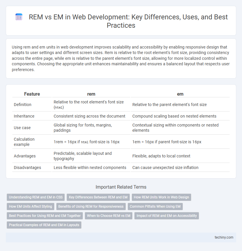
Using rem and em units in web development improves scalability and accessibility by enabling responsive design that adapts to user settings and different screen sizes. Rem is relative to the root element's font size, providing consistency across the entire page, while em is relative to the parent element's font size, allowing for more localized control within components. Choosing the appropriate unit enhances maintainability and ensures a balanced layout that respects user preferences.
Table of Comparison
| Feature | rem | em |
|---|---|---|
| Definition | Relative to the root element's font size (html) |
Relative to the parent element's font size |
| Inheritance | Consistent sizing across the document | Compound scaling based on nested elements |
| Use case | Global sizing for fonts, margins, paddings | Contextual sizing within components or nested elements |
| Calculation example | 1rem = 16px if html font-size is 16px |
1em = 16px if parent font-size is 16px |
| Advantages | Predictable, scalable layout and typography | Flexible, adapts to local context |
| Disadvantages | Less flexible within nested components | Can cause unexpected size inflation |
Understanding REM and EM in CSS
REM and EM are both relative units in CSS used for scalable and responsive web design. REM (Root EM) is relative to the root element's font size, typically the `` tag, enabling consistent sizing across the entire webpage. EM units are relative to the font size of their closest parent element, making them useful for nested components where size inheritance is essential.
Key Differences Between REM and EM
REM units in web development are relative to the root element's font size, ensuring consistent scaling across an entire webpage, while EM units are relative to the font size of their parent element, causing variations in nested elements. Using REM provides predictable responsiveness and simplifies global adjustments in typography design. EM offers flexibility for component-based styling but may lead to unintended size compounding in deeply nested structures.
How REM Units Work in Web Design
REM units in web design are relative to the root element's font size, typically the tag, enabling consistent and scalable sizing across a website. Unlike EM units, which are relative to the parent element's font size, REM units maintain uniformity regardless of nesting levels, improving layout predictability. This behavior allows developers to create responsive designs by adjusting the root font size, influencing all REM-based measurements site-wide.
How EM Units Affect Styling
EM units in web development scale relative to the font size of their closest parent element, making them ideal for creating flexible and adaptive layouts. Unlike REM units that reference the root font size, EM units enable nested elements to inherit and adjust styles dynamically based on local context, promoting modular and responsive design. This cascading relationship allows precise control over component spacing, padding, and typography, enhancing user experience across different devices.
Benefits of Using REM for Responsiveness
REM units scale consistently based on the root element's font size, enabling uniform and predictable resizing across an entire web page. This consistency enhances responsiveness by simplifying adjustments for different screen sizes and user settings. Using REM improves accessibility and maintains design coherence without complex calculations needed for EM-based layouts.
Common Pitfalls When Using EM
Common pitfalls when using em units in web development include inconsistent sizing due to inheritance, as em values are relative to the font size of their parent element, leading to unpredictable results in nested elements. Developers often overlook the compounding effect, where multiple nested elements with em units can cause exponential scaling, making layouts difficult to control. Proper understanding of the cascading context and careful structuring of styles is essential to avoid these issues and maintain design consistency.
Best Practices for Using REM and EM Together
Using REM and EM units together enhances responsive web design by balancing scalability and context sensitivity. REM units provide consistent sizing relative to the root font size, ideal for global elements like typography and layout dimensions, while EM units adapt components locally, such as padding and margins within modular components. Best practices recommend setting base font size with REM for uniformity and leveraging EM for nested elements to maintain proportional spacing and improve accessibility across diverse devices.
When to Choose REM vs EM
REM units are ideal for maintaining consistent typography and layout across an entire website since they are based on the root element's font size, allowing scalable and uniform design adjustments. EM units excel when you need element-specific scaling, such as nested components or buttons, as they adapt relative to a parent element's font size, providing flexible and context-aware sizing. Choosing REM ensures global consistency, while EM is optimal for localized and modular styling within components.
Impact of REM and EM on Accessibility
REM and EM units significantly influence web accessibility by enhancing scalability and readability across devices. REM provides consistent sizing relative to the root element, ensuring uniform text scaling for users with visual impairments. EM adjusts sizes based on the parent element, allowing flexible content adaptation, but may cause inconsistent resizing if nested deeply, potentially impacting accessibility.
Practical Examples of REM and EM in Layouts
Using REM units in web layouts ensures consistent spacing and font sizes relative to the root element, making global adjustments straightforward by modifying one value in the CSS root. EM units adapt sizing within components based on the parent element's font size, ideal for nested elements like buttons or form inputs that need to scale contextually. For example, a navigation menu item might use 1.5rem for uniform sizing across the site, while submenu items use 1em to maintain proportional scaling inside the parent menu container.
rem vs em Infographic

 techiny.com