 techiny.com
 Flexbox excels at creating one-dimensional layouts, making it ideal for aligning items in a row or column with dynamic spacing. Grid offers a powerful two-dimensional system, allowing precise control over rows and columns simultaneously, perfect for complex page designs. Choosing between Flexbox and Grid depends on whether your layout requires linear alignment or multi-dimensional arrangement.
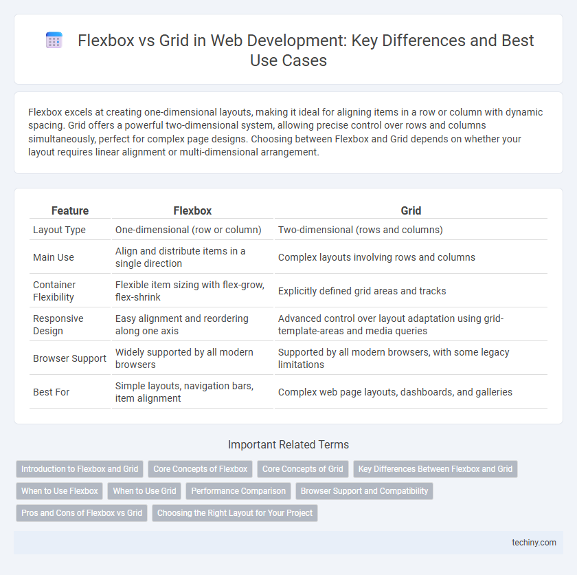
Table of Comparison
| Feature | Flexbox | Grid |
|---|---|---|
| Layout Type | One-dimensional (row or column) | Two-dimensional (rows and columns) |
| Main Use | Align and distribute items in a single direction | Complex layouts involving rows and columns |
| Container Flexibility | Flexible item sizing with flex-grow, flex-shrink | Explicitly defined grid areas and tracks |
| Responsive Design | Easy alignment and reordering along one axis | Advanced control over layout adaptation using grid-template-areas and media queries |
| Browser Support | Widely supported by all modern browsers | Supported by all modern browsers, with some legacy limitations |
| Best For | Simple layouts, navigation bars, item alignment | Complex web page layouts, dashboards, and galleries |
Introduction to Flexbox and Grid
Flexbox is a one-dimensional layout model designed for arranging items in rows or columns, optimizing space distribution within a container. CSS Grid is a two-dimensional system that manages both rows and columns, ideal for complex layouts with precise control over placement. Both techniques enhance responsive design by simplifying alignment and spacing compared to traditional box models.
Core Concepts of Flexbox
Flexbox is designed for one-dimensional layout, focusing on distributing space along a single axis either horizontally (row) or vertically (column). Key properties like justify-content, align-items, and flex-grow enable flexible alignment and responsive resizing of child elements within a container. This model excels in managing dynamic content and adjusting element sizes based on available space, making it ideal for linear component arrangements in web development.
Core Concepts of Grid
CSS Grid centers on a two-dimensional layout system that manages both rows and columns, allowing precise placement of items within a grid container. It utilizes grid lines, cells, and areas to define the structure, enabling complex and responsive layouts with minimal code. The core concepts include explicit grid definition with grid-template-rows and grid-template-columns, automatic placement, and alignment properties like justify-items and align-items for controlling content flow.
Key Differences Between Flexbox and Grid
Flexbox excels at creating one-dimensional layouts, either in rows or columns, making it ideal for aligning items along a single axis with flexible sizing and spacing. CSS Grid offers a two-dimensional system, enabling designers to control both rows and columns simultaneously for complex, structured layouts. Unlike Flexbox, Grid provides explicit placement of items through grid lines and areas, which is essential for building comprehensive page designs.
When to Use Flexbox
Flexbox excels in aligning and distributing space among items in a single dimension, making it ideal for components like navigation bars, menus, and toolbars. It handles dynamic content sizes with ease, allowing flexible item resizing and reordering in response to screen size changes. Use Flexbox for simple layouts requiring alignment along a row or column without the complexity of two-dimensional grid arrangements.
When to Use Grid
CSS Grid is ideal for creating complex two-dimensional layouts where both rows and columns need precise control, such as magazine-style designs or dashboard interfaces. Use Grid when aligning items into a strict grid structure with overlapping elements or when layout requires consistent spacing and alignment across both axes. Flexbox is better suited for simpler, one-dimensional layouts, making Grid the optimal choice for advanced and detailed page arrangements.
Performance Comparison
Flexbox excels in handling one-dimensional layouts with minimal reflows, often resulting in faster rendering times for simpler alignment tasks, whereas CSS Grid better manages complex two-dimensional layouts with enhanced control over rows and columns but may incur a slight performance overhead due to its complexity. Benchmark tests indicate Flexbox generally performs better for single-axis alignment and small-scale components, while Grid's performance cost becomes negligible in large, content-rich interfaces where precise grid placement reduces manual code and rendering recalculations. Developers should weigh Flexbox's lightweight, efficient performance for straightforward layouts against Grid's robust capabilities that optimize scalability and maintainability despite a modest increase in computational load.
Browser Support and Compatibility
Flexbox and CSS Grid both enjoy extensive browser support, with Flexbox being compatible across all major browsers including older versions like IE10, making it a reliable choice for simple layouts. CSS Grid offers powerful two-dimensional layout capabilities but requires modern browsers such as Chrome 57+, Firefox 52+, Safari 10.1+, and Edge 16+, limiting its use in legacy environments. Developers should assess target audience browser usage to decide between Grid's advanced features and Flexbox's broader compatibility.
Pros and Cons of Flexbox vs Grid
Flexbox excels in one-dimensional layouts by offering flexible alignment and distribution of space along a single axis, making it ideal for responsive designs and small components. Grid provides a two-dimensional system that allows precise control over rows and columns, suitable for complex page layouts but with a steeper learning curve and potential performance impacts on large-scale projects. While Flexbox is simpler and more dynamic for linear layouts, Grid handles intricate designs better, though it may require more upfront planning and CSS.
Choosing the Right Layout for Your Project
Flexbox excels in one-dimensional layouts, efficiently aligning items in rows or columns with flexible spacing, making it ideal for navigation bars and small-scale components. CSS Grid offers a robust two-dimensional system, enabling precise control over both rows and columns, which suits complex web page structures and responsive designs. Selecting the right layout depends on project requirements: use Flexbox for linear arrangements and Grid for intricate layouts requiring extensive control.
flexbox vs grid Infographic