 techiny.com
 Responsive web design fluidly adjusts layouts based on screen size using flexible grids, ensuring seamless user experiences across devices. Adaptive design employs fixed layouts tailored for specific screen widths, delivering optimized performances for targeted devices. Choosing between responsive and adaptive depends on project goals, development complexity, and desired user interaction consistency.
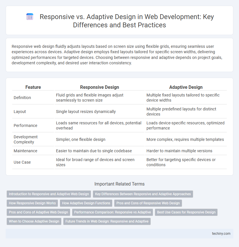
Table of Comparison
| Feature | Responsive Design | Adaptive Design |
|---|---|---|
| Definition | Fluid grids and flexible images adjust seamlessly to screen size | Multiple fixed layouts tailored to specific device widths |
| Layout | Single layout resizes dynamically | Multiple predefined layouts for distinct devices |
| Performance | Loads same resources for all devices, potential overhead | Loads device-specific resources, optimized performance |
| Development Complexity | Simpler, one flexible design | More complex, requires multiple templates |
| Maintenance | Easier to maintain due to single codebase | Harder to maintain multiple versions |
| Use Case | Ideal for broad range of devices and screen sizes | Better for targeting specific devices or conditions |
Introduction to Responsive and Adaptive Web Design
Responsive web design uses flexible grids and media queries to create layouts that fluidly adjust to any screen size, ensuring seamless user experience across devices. Adaptive web design relies on predefined screen widths and distinct templates to deliver optimized experiences tailored to specific devices. Both approaches aim to enhance usability but differ in structural techniques and implementation complexity.
Key Differences Between Responsive and Adaptive Approaches
Responsive web design uses fluid grids and flexible images to create layouts that automatically adjust to any screen size, ensuring consistent user experience across devices. Adaptive design relies on predefined static layouts tailored for specific screen widths, detecting the device and loading the most appropriate layout. Key differences include responsiveness to dynamic resizing in responsive design versus device-specific optimization in adaptive design.
How Responsive Design Works
Responsive design works by using flexible grid layouts, fluid images, and CSS media queries to automatically adjust the website's content based on the screen size and resolution of the device. It ensures optimal viewing experiences by scaling elements proportionally without requiring separate layouts for different devices. This approach improves accessibility and usability across smartphones, tablets, laptops, and desktops by dynamically adapting to varying display environments.
How Adaptive Design Functions
Adaptive design functions by detecting the device's screen size and loading a specific layout tailored for that viewport, utilizing fixed breakpoints to optimize user experience. It relies on multiple predefined templates or sets of design layouts that activate based on the user's device characteristics, such as screen resolution or browser window size. This method ensures precise control over how content is displayed across various devices, improving performance by serving only necessary elements.
Pros and Cons of Responsive Web Design
Responsive Web Design offers a seamless user experience across various devices by using flexible grids, images, and CSS media queries to adapt content fluidly. It improves SEO rankings due to a single URL structure and reduces maintenance efforts compared to maintaining separate sites. However, responsive design can lead to slower load times on complex layouts and may present challenges in optimizing user experience for highly distinct device capabilities.
Pros and Cons of Adaptive Web Design
Adaptive web design offers tailored user experiences by creating multiple fixed layouts for different screen sizes, enhancing performance and usability on targeted devices. It provides precise control over content presentation, reducing loading times by delivering device-specific resources, but requires more development time and maintenance due to the multiple versions. The approach may reduce flexibility for new or unusual screen sizes, potentially leading to inconsistent user experiences across devices.
Performance Comparison: Responsive vs Adaptive
Responsive web design dynamically adjusts layouts using flexible grids and CSS media queries, resulting in seamless performance across diverse devices with minimal loading times. Adaptive design relies on predefined static layouts tailored for specific screen sizes, potentially increasing server requests and load times due to device detection and resource swapping. Performance comparisons show that responsive design generally offers faster content delivery and improved user experience on variable networks, while adaptive design may excel in optimized displays for select devices but risks slower performance on unsupported viewports.
Best Use Cases for Responsive Design
Responsive web design excels in delivering seamless experiences across diverse screen sizes by using flexible grids and fluid images that adjust dynamically. It is best suited for websites requiring consistent layout adaptation without multiple device-specific versions, such as blogs, news sites, and corporate websites. Prioritizing responsiveness improves SEO rankings and accessibility by ensuring content remains user-friendly across smartphones, tablets, and desktops.
When to Choose Adaptive Design
Adaptive design is ideal when targeting a specific set of devices with unique screen sizes or resolutions, as it delivers tailored layouts for each device category. It enhances performance by loading only necessary assets and optimizes user experience on devices with varying capabilities. Businesses prioritizing precise control over how content appears across different devices often benefit from adaptive design.
Future Trends in Web Design: Responsive and Adaptive
Future trends in web design emphasize the integration of responsive and adaptive techniques to create seamless user experiences across diverse devices and screen sizes. Responsive design relies on flexible grids and media queries to fluidly adjust layouts, while adaptive design detects device types to serve tailored interfaces, optimizing performance and usability. Emerging advancements in AI-driven personalization and progressive web apps are expected to further enhance both responsive and adaptive frameworks, driving innovation in creating dynamic, future-proof websites.
Responsive vs Adaptive Infographic