 techiny.com
 Styled-Components and Emotion are popular CSS-in-JS libraries that enhance web development by enabling scoped styling within JavaScript files, improving component maintainability. Styled-Components offers a more intuitive syntax for defining styles directly inside components, while Emotion provides greater flexibility with its powerful theming and style composition capabilities. Both libraries support dynamic styling and server-side rendering, making them ideal choices for modern React applications requiring efficient, modular CSS management.
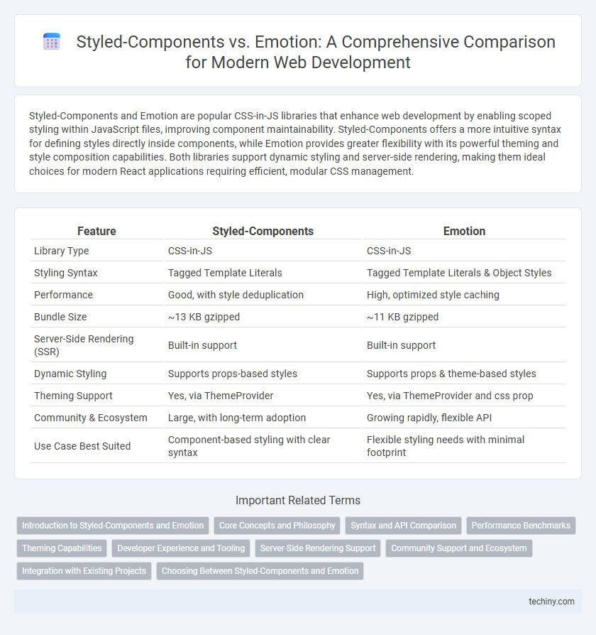
Table of Comparison
| Feature | Styled-Components | Emotion |
|---|---|---|
| Library Type | CSS-in-JS | CSS-in-JS |
| Styling Syntax | Tagged Template Literals | Tagged Template Literals & Object Styles |
| Performance | Good, with style deduplication | High, optimized style caching |
| Bundle Size | ~13 KB gzipped | ~11 KB gzipped |
| Server-Side Rendering (SSR) | Built-in support | Built-in support |
| Dynamic Styling | Supports props-based styles | Supports props & theme-based styles |
| Theming Support | Yes, via ThemeProvider | Yes, via ThemeProvider and css prop |
| Community & Ecosystem | Large, with long-term adoption | Growing rapidly, flexible API |
| Use Case Best Suited | Component-based styling with clear syntax | Flexible styling needs with minimal footprint |
Introduction to Styled-Components and Emotion
Styled-Components and Emotion are popular CSS-in-JS libraries that enable developers to write CSS directly within JavaScript, enhancing component-based styling in React applications. Styled-Components uses tagged template literals to create scoped, dynamic styles, promoting maintainable and reusable UI components with automatic critical CSS injection. Emotion offers both string and object styles, delivering high performance with flexible theming and powerful style composition capabilities tailored for scalable web development.
Core Concepts and Philosophy
Styled-Components and Emotion both leverage CSS-in-JS principles, enabling developers to write CSS styles within JavaScript files for component-based styling. Styled-Components emphasizes tagged template literals for defining styles and attaching them directly to React components, promoting a seamless integration between style and behavior. Emotion offers a flexible API that supports both styled and object-based styles, focusing on high performance and developer experience with features like theming and powerful style composition.
Syntax and API Comparison
Styled-Components and Emotion both offer CSS-in-JS solutions with similar APIs, but differ in syntax nuances and customization options. Styled-Components uses tagged template literals exclusively, promoting a straightforward syntax ideal for defining styled React components, whereas Emotion supports both styled components and css-in-js object styles, offering greater flexibility in syntax. Emotion's API provides enhanced theming capabilities and performance optimizations, making it preferable for projects requiring dynamic styling and advanced customization.
Performance Benchmarks
Styled-Components and Emotion both offer efficient CSS-in-JS solutions with notable differences in performance benchmarks. Emotion typically demonstrates faster runtime performance and smaller bundle sizes due to its optimized caching and less aggressive style recalculations. Benchmarks reveal Emotion can reduce style injection time by up to 30% compared to Styled-Components, making it a preferred choice for high-performance React applications.
Theming Capabilities
Styled-Components and Emotion both offer robust theming capabilities designed to enhance consistency in web development projects. Styled-Components utilizes a ThemeProvider component to seamlessly inject theme variables and supports dynamic styling based on theme props, simplifying global style management. Emotion provides a flexible theming system compatible with React's context API, enabling developers to create scalable, customizable themes with optimized performance for large-scale applications.
Developer Experience and Tooling
Styled-Components and Emotion both provide excellent developer experience with strong support for tagged template literals and dynamic styling in React environments. Emotion offers enhanced performance optimizations and a more flexible API, allowing finer control over styling with its CSS-in-JS capabilities and better integration with TypeScript tooling. Styled-Components excels in built-in theming and seamless debugging tools like styled-components' display names, making it user-friendly for rapid prototyping and maintaining consistent design systems.
Server-Side Rendering Support
Styled-Components and Emotion both provide robust server-side rendering (SSR) support, enabling critical CSS extraction to improve performance and reduce load times. Styled-Components offer automatic style injection and seamless integration with frameworks like Next.js, ensuring styles are rendered correctly on the server. Emotion also excels in SSR with optimized CSS extraction and supports multiple SSR frameworks through its flexible API, making it a versatile choice for isomorphic React applications.
Community Support and Ecosystem
Styled-Components boasts a larger community with extensive resources, including numerous tutorials, plugins, and third-party integrations, making it a popular choice among React developers. Emotion offers a robust ecosystem as well, with strong TypeScript support and flexible styling approaches that appeal to developers seeking customization and performance. Both libraries benefit from active GitHub repositories and regular updates, but Styled-Components' broader adoption translates into more extensive community-driven solutions and troubleshooting.
Integration with Existing Projects
Styled-Components seamlessly integrates with existing React projects by allowing developers to write actual CSS within JavaScript, enabling component-level styling without overhauling the current architecture. Emotion provides similar flexibility but offers both the styled API and a css prop, which can be incrementally introduced to projects for more granular control over styles. Both libraries support server-side rendering and theming, ensuring smooth adoption in established codebases without performance compromises.
Choosing Between Styled-Components and Emotion
Choosing between Styled-Components and Emotion depends on project requirements and performance needs. Styled-Components offers a more intuitive, CSS-in-JS approach with automatic critical CSS extraction, while Emotion provides greater flexibility with both styled and css prop APIs, often resulting in faster runtime performance and smaller bundle sizes. Evaluate factors like developer experience, theming support, and style encapsulation to determine the best fit for scalable, maintainable web development.
Styled-Components vs Emotion Infographic