Data visualization transforms complex Big Data into interactive, easily interpretable graphics, enabling quicker insights and pattern recognition. Data reporting compiles raw data into structured, formatted documents that emphasize accuracy and comprehensive analysis for decision-making. While visualization enhances data understanding through visuals, reporting provides detailed records and supports systematic evaluation of Big Data trends.
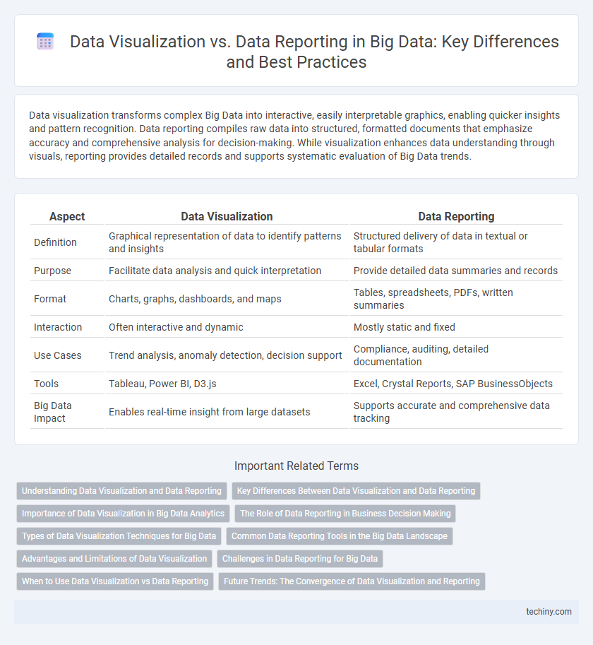
Table of Comparison
| Aspect | Data Visualization | Data Reporting |
|---|---|---|
| Definition | Graphical representation of data to identify patterns and insights | Structured delivery of data in textual or tabular formats |
| Purpose | Facilitate data analysis and quick interpretation | Provide detailed data summaries and records |
| Format | Charts, graphs, dashboards, and maps | Tables, spreadsheets, PDFs, written summaries |
| Interaction | Often interactive and dynamic | Mostly static and fixed |
| Use Cases | Trend analysis, anomaly detection, decision support | Compliance, auditing, detailed documentation |
| Tools | Tableau, Power BI, D3.js | Excel, Crystal Reports, SAP BusinessObjects |
| Big Data Impact | Enables real-time insight from large datasets | Supports accurate and comprehensive data tracking |
Understanding Data Visualization and Data Reporting
Data visualization transforms complex Big Data into intuitive charts and graphs, enabling faster pattern recognition and decision-making. Data reporting compiles and presents structured data summaries, emphasizing accuracy, consistency, and detailed insights for performance tracking. Understanding the distinct roles of visualization tools and reporting platforms is crucial for leveraging Big Data effectively in analytics and business intelligence.
Key Differences Between Data Visualization and Data Reporting
Data visualization transforms complex datasets into interactive graphs and charts, enabling intuitive pattern recognition and faster decision-making. Data reporting compiles structured information into static tables and summaries, focusing on accuracy and comprehensive documentation of historical data. Visualization prioritizes user engagement and insight discovery, whereas reporting emphasizes data validation and regulatory compliance.
Importance of Data Visualization in Big Data Analytics
Data visualization transforms complex Big Data sets into intuitive graphical formats, enabling faster pattern recognition and insightful decision-making. Visualization tools enhance the understanding of large-scale data by revealing trends, correlations, and outliers that raw reporting metrics may obscure. Effective data visualization drives actionable analytics, improving strategic planning and operational efficiency across diverse business domains.
The Role of Data Reporting in Business Decision Making
Data reporting transforms raw big data into structured formats, enabling clear communication of key performance indicators and trends crucial for business decision-making. It provides standardized reports that facilitate timely and accurate assessments, supporting strategic planning and operational adjustments. Effective data reporting enhances transparency and empowers stakeholders to make informed decisions based on reliable, easily interpretable data summaries.
Types of Data Visualization Techniques for Big Data
Heatmaps, scatter plots, and tree maps are essential data visualization techniques for Big Data, enabling the detection of patterns and outliers in vast datasets. Interactive dashboards use real-time data filtering and drill-down capabilities to provide dynamic insights across multiple dimensions. Network graphs and geospatial maps visualize complex relationships and spatial distributions, facilitating comprehensive analysis of interconnected Big Data sources.
Common Data Reporting Tools in the Big Data Landscape
Common data reporting tools in the Big Data landscape include Tableau, Power BI, and Looker, which provide interactive dashboards and customizable report generation. These tools enable organizations to aggregate large-scale datasets, perform real-time analysis, and deliver actionable insights through visual or tabular formats. Their integration with Hadoop, Spark, and cloud platforms like AWS and Azure ensures seamless processing and presentation of complex Big Data environments.
Advantages and Limitations of Data Visualization
Data visualization excels in revealing patterns, trends, and outliers within Big Data through intuitive graphical formats, enabling faster decision-making and enhanced data comprehension compared to traditional data reporting. Its advantages include improved engagement, better retention of information, and the ability to handle vast datasets dynamically. However, limitations arise from the potential for misinterpretation due to poor design choices, scalability challenges with extremely large or complex datasets, and the reliance on users' visual literacy skills.
Challenges in Data Reporting for Big Data
Challenges in data reporting for big data include managing the sheer volume and variety of data sources, which complicate accurate aggregation and timely generation of reports. Data reporting often struggles with latency issues due to the need for processing large datasets, resulting in outdated or less actionable insights. Ensuring data quality and consistency across diverse platforms further intensifies difficulties in delivering reliable reports for decision-making.
When to Use Data Visualization vs Data Reporting
Data visualization is ideal for exploring complex Big Data patterns, enabling quick insights through graphical representations such as charts and heatmaps that highlight trends and anomalies. Data reporting suits scenarios requiring detailed, structured summaries of datasets, often used for compliance, audit trails, or executive decision-making with standardized tables and metrics. Use data visualization to facilitate interactive analysis and identify correlations, while data reporting provides comprehensive documentation and precise numerical details.
Future Trends: The Convergence of Data Visualization and Reporting
Emerging technologies in big data analytics drive the convergence of data visualization and reporting, integrating interactive dashboards with automated reporting tools to enhance real-time decision-making. Advanced AI algorithms enable predictive analytics within visualization platforms, transforming static reports into dynamic, data-driven insights. This fusion supports more intuitive data interpretation, empowering businesses to respond swiftly to evolving market trends.
Data Visualization vs Data Reporting Infographic